Redesign
Zynga PlayApp

Overview
The Zynga Play App (ZPlay) is an important internal tool for Zynga employees, providing developers, designers, and managers with a dedicated platform to test and launch new games and features efficiently.
Role: UX/UI Designer
Timeline: July - August 2023
Team: Internal Design Team
Empathizing + Defining
User Interviews: I started my design process by interviewing designers, developers, interns and managers on different teams within the company.
Experience Map + Service Blueprint: Creating an experience map and a service blueprint allowed me to illustrate the user journey, emphasizing pain points and improvements across different touchpoints based on the user interviews I conducted.


From this, I defined the exact pain points I wanted to target in this redesign…
🎮 Low Participation in Game Testing: New employees, such as interns, are unsure which games they should be testing, leading to low participation in testing and exploring new games.
👀 Inefficient Feedback Process: The existing feedback submission process is complicated, leading users to resort to external tools like emailing teams directly, which is messy and disorganized.
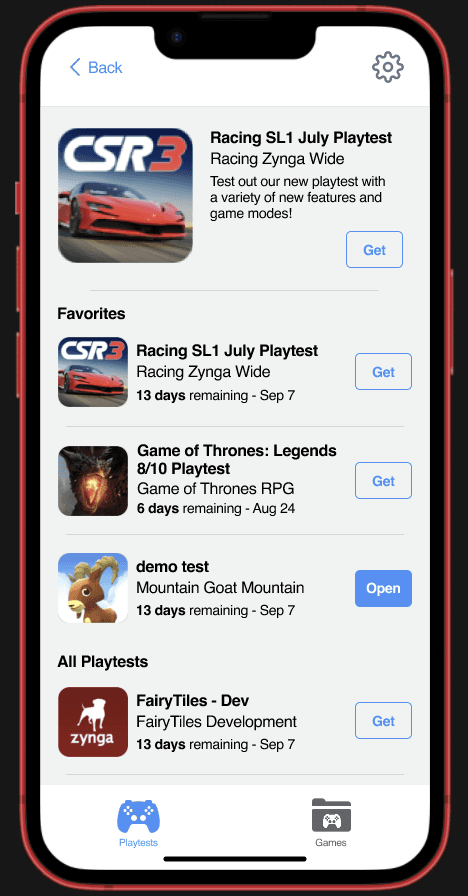
⭐ Underutilization of the Favourites Feature: The Favourites feature lacks visibility and awareness, resulting in its underutilization by users who are often unaware of its existence or benefits.
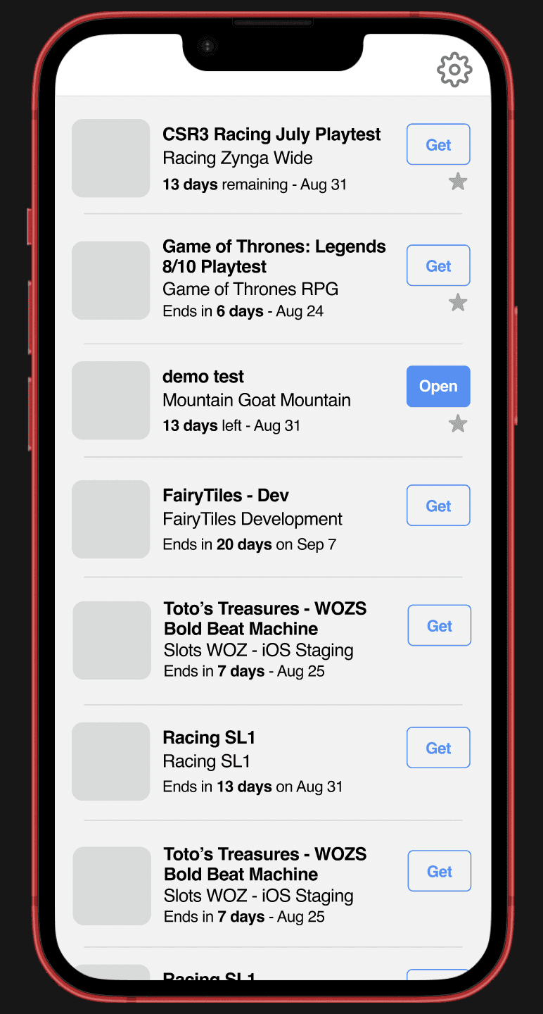
ℹ️ Cluttered and Inaccessible Playtest Information: Playtest and game displays are cluttered and hard to read, with a lack of clear distinction between active and inactive playtests, and challenges in accessing non-alphabetically listed games with active playtests.
Design Challenge #1: Game Promotion
How might we increase new employee participation in testing and exploring new games?

User Research
The Problem: After conducting user interviews with a variety of stakeholders I found that newcomers such as interns are unsure of what games they can/should be testing
Why do we want newcomers to use this app?
Test games/features before public release to find usability issues and contribute their own ideas.
Gain a comprehensive understanding of the company's products, development processes, and interface functionalities.
What Are Others Doing To Promote
Games In-App?
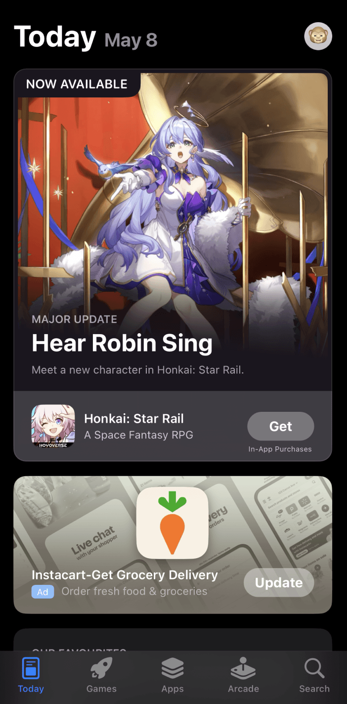


✅ Pop-ups when the app is opened
✅ Promoting new and important games/news at the top of the users feed
✅ Having a whole tab in the app for new games
Nudging vs Disrupting
Nudging
✅ Users have the choice to engage
❌ Lower immediate engagement
Disrupting
✅ Higher likelihood of user engagement
❌ Annoying, needs frequent redesigns = Not feasible
I chose to go with the less intrusive approach (nudging), as it prioritizes the user's experience as well as business goals.
It allows the user to see the game promotion as a gentle push to test that game, rather than an annoying interruption that needs more effort from the company.
Design Challenge #2: Feedback Feature
How might we enhance the accessibility and functionality of obtaining feedback from users?

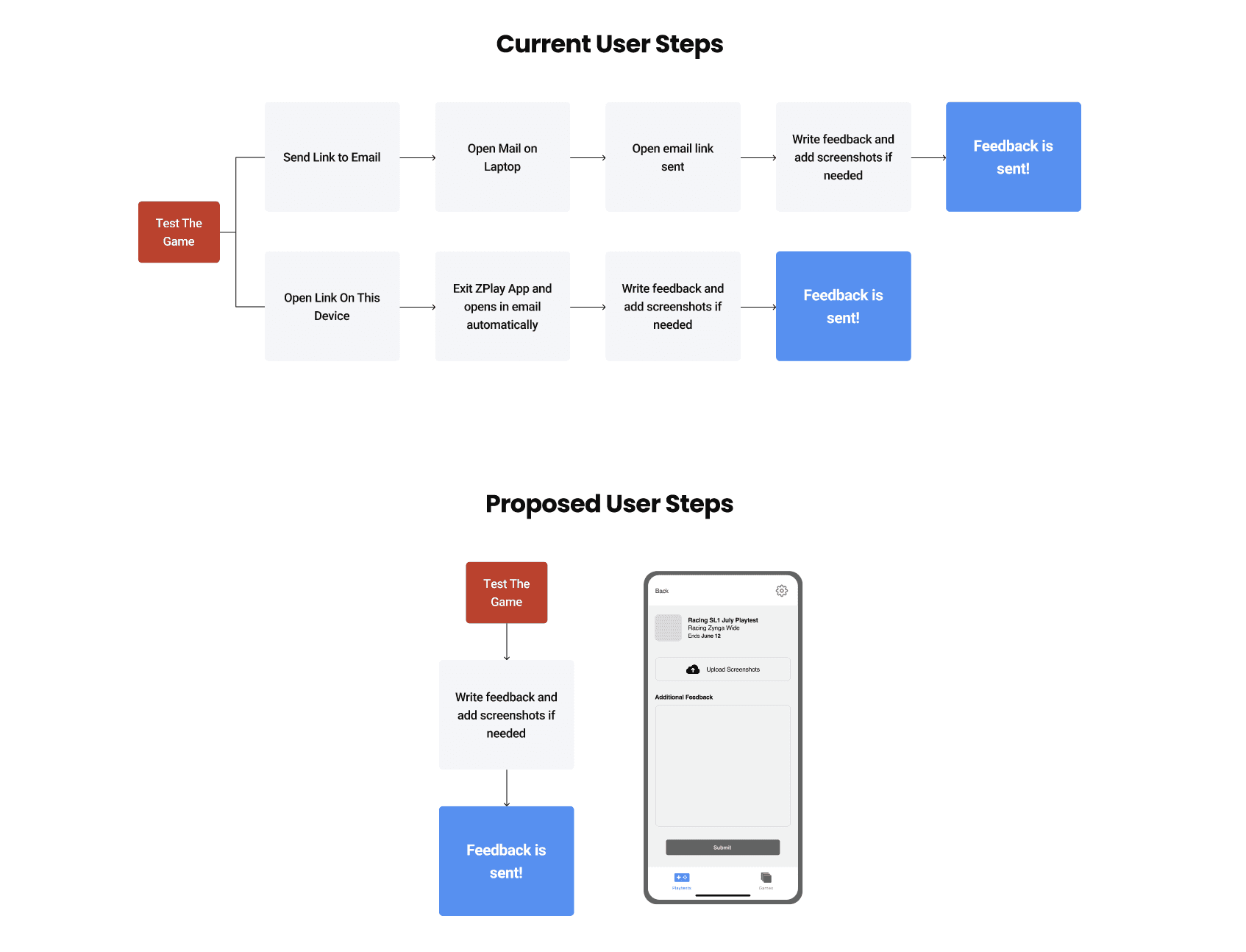
Breaking It Down
Through user interviews conducted with stakeholders, I found that there is…
Low awareness and usage of the Feedback feature.
Complicated submission process; users resort to emailing teams directly.
Competitor Analysis


Findings:
✅ In-app feedback used by the App Store, Google Play, Yelp, etc.
✅ Simple, quick feedback (star ratings out of 5).
✅ Image-uploading feature for visual issue reporting.
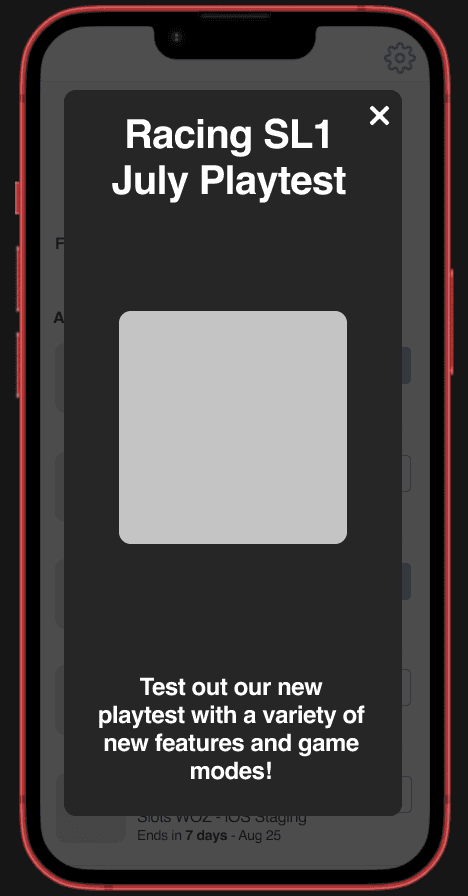
Implementing Ideas
Goal: Minimise the number of steps for submitting feedback.
Process: I created a flow diagram to reduce steps.
Usability Test Findings

Changes Made After Testing:
Added a star rating
Changed the order of information presented
User Goals
✅ Users preferred the in-app feedback feature over external tools.
✅ Users completed the feedback process 4x faster than the original method
Business Goals
✅ More data can be collected
✅ Data is more organized and meaningful
Final Outcome

Redesign Improvements:
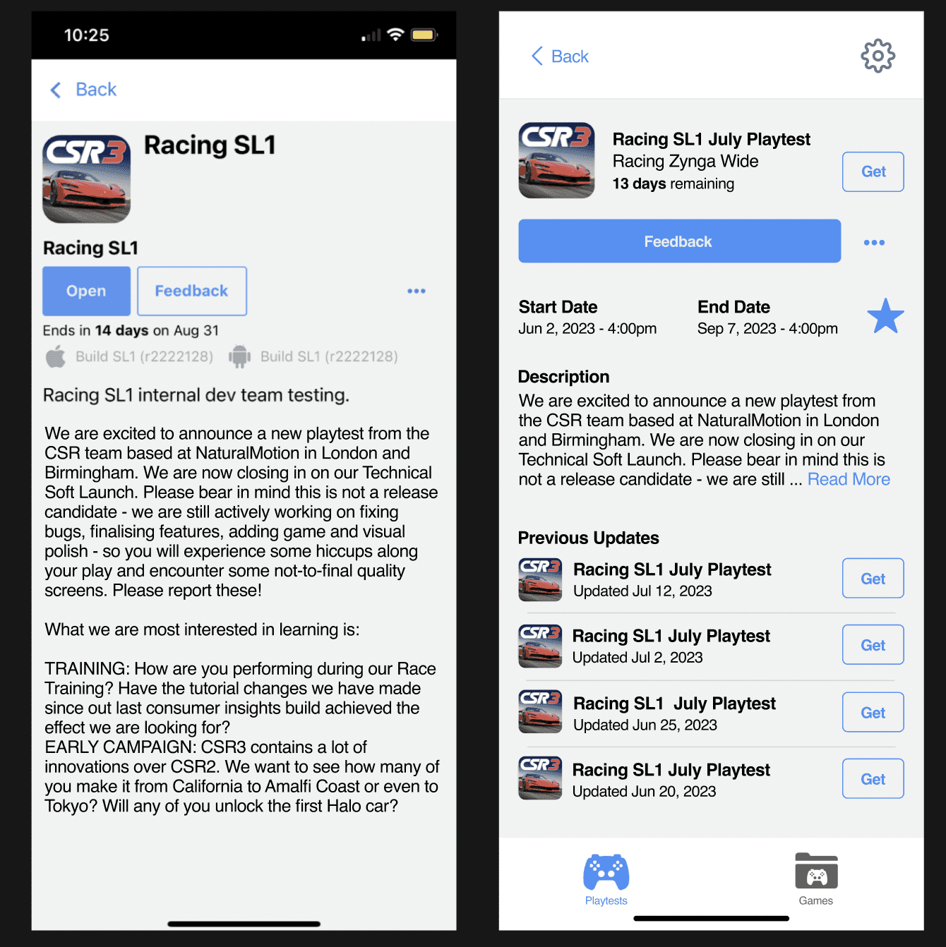
Increased Awareness: Larger button for a stronger call to action.
Simplistic Feedback Approach: In-app feedback for a streamlined submission process.
“Wow, this is so much more intuitive than the previous version” -Designer
Design Challenge #3: Favourites Feature
How might we increase visibility and awareness of the Favourites feature to encourage its use and demonstrate its benefits?
Current State
Only games can be favourited, not playtests
Users were generally unaware of this feature as a whole
Lack of visibility led to underutilization
Feature Location Options
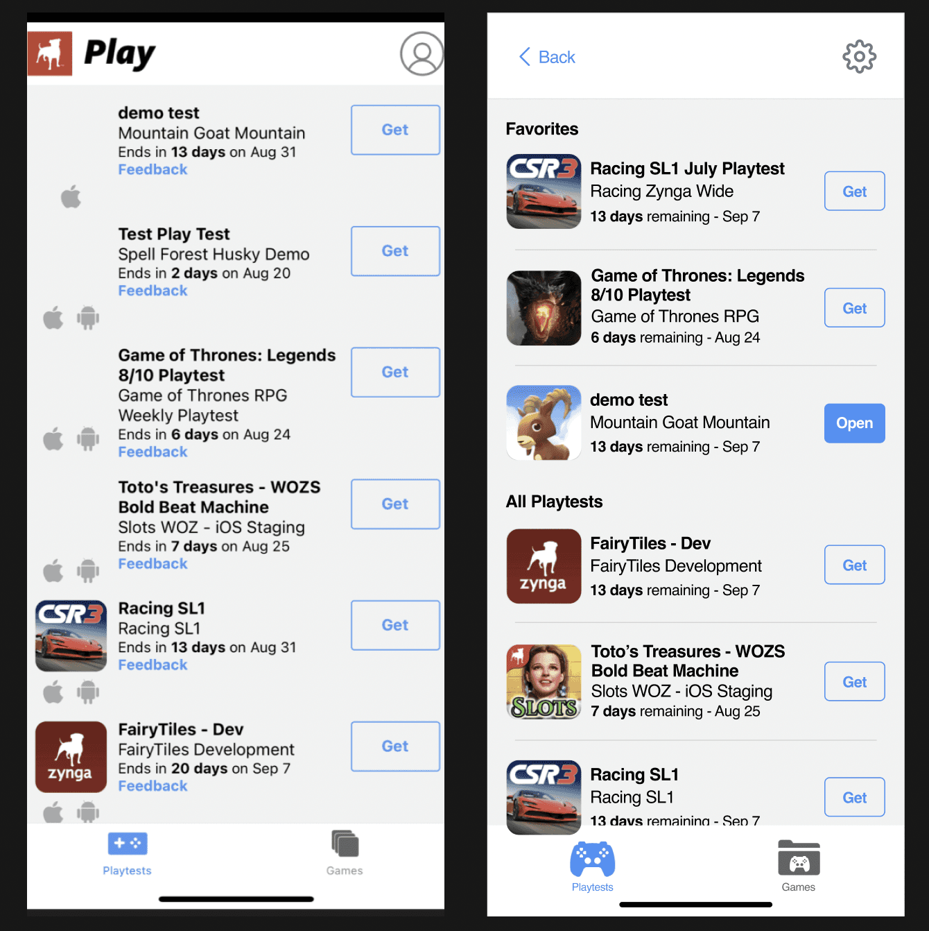
I chose to go with the 'Titled Sections' option as it made the most sense. Users immediately see and understand the feature's existence and purpose. Even when there are no favourited playtests the feature is clearly shown.

Favourites Moved To Top:
✅ More playtest's can fit on the screen.
❌ May clutter the interface, could confuse users if not favourited.
Titled Sections:
✅ Clear separation, users see the feature even if not used.
❌ Takes up space at the top of the users feed.
Results and Validation
Usability Tests: Users were 4x as likely to notice the feature.
Feedback: Positive reception, users found the feature easily and understood its benefits.
"Having the favourites right at the top makes it so easy to find what I need quickly."
- Developer
Design Challenge #4: Playtests
How might we organize and display playtest information to enhance the readability, accessibility, and management of current and historical playtests?
Identified Issues
User Needs
Users want to see the date of the last playtest update without asking developers.
Users need more informative details on playtest duration.
Users desire the ability to revisit previous playtests for tracking purposes.
Current Challenges
Cluttered and hard-to-read playtest and game displays
Lack of clear distinction between active and inactive playtests.
Users face challenges in accessing games not listed alphabetically as having active playtests.
Ideation and Prototyping

Initial Concepts:
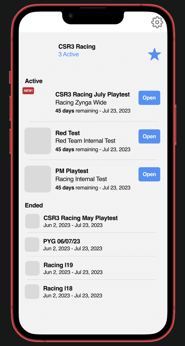
Enhanced Visibility:
Clear distinction between active and inactive playtests.
Improved labelling and categorization.
Improved Information Display:
Adding dates of the last update directly on the playtest cards.
Providing more informative playtest duration details.
Management Tools:
Introducing a feature to revisit previous playtests.
Filtering and sorting options for better organization.
Iterations:
Multiple design iterations were created based on user feedback.
Focus on reducing clutter and improving readability.
Pitch To Stakeholders
Gathered feedback and made minor adjustments to align with stakeholder expectations.
Results:
Positive feedback on readability and ease of access.
Users appreciated the ability to quickly find relevant information and manage playtests more effectively.
Final Outcome

"The new layout makes it so much easier to find the information I need quickly without getting lost in clutter and having to ask developers for when the last update on a playtest was." - Manager
Tracking KPI's
While my designs had not fully been developed by the time my internship had ended, I left KPIs that could be tracked to test for effectiveness
Design Challenge #1: Game Promotion
KPI: Increase in Employee Participation in Game Testing
Metric: Percentage increase in the number of unique users engaging with game testing.
Baseline: Current number of unique users participating in game testing.
Target: Achieve a 30% increase in participation within the first three months post-implementation.
Design Challenge #2: Feedback Feature
KPI: Enhanced Feedback Submission
Metric: Number of feedback submissions received through the in-app feedback feature.
Baseline: Current number of feedback submissions through external tools (e.g., email).
Target: Reduce external feedback submissions by 80%, with a corresponding increase in in-app feedback submissions.
Design Challenge #3: Favourites
KPI: Utilization of the Favourites Feature
Metric: Number of users utilizing the Favourites feature.
Baseline: Current usage rate of the Favourites feature.
Target: Achieve a 50% increase in the usage of the Favourites feature within two months.
Design Challenge #4: Playtests
KPI: Improved Playtest Management
Metric: User satisfaction with playtest information accessibility and organization.
Baseline: Current satisfaction levels measured through user surveys and feedback.
Target: Improve user satisfaction ratings by 25%, as measured by post-implementation surveys.
Key Takeaways

Supervisor and stakeholder meetings played a crucial role in refining and the integration of design and development perspectives.
Insights gained include the importance of user awareness, streamlined navigation, and continuous collaboration with stakeholders for successful redesigns. The iterative design process allowed for agile adaptations, ensuring the final product met both user needs and business goals.